Where creativity & strategy come together
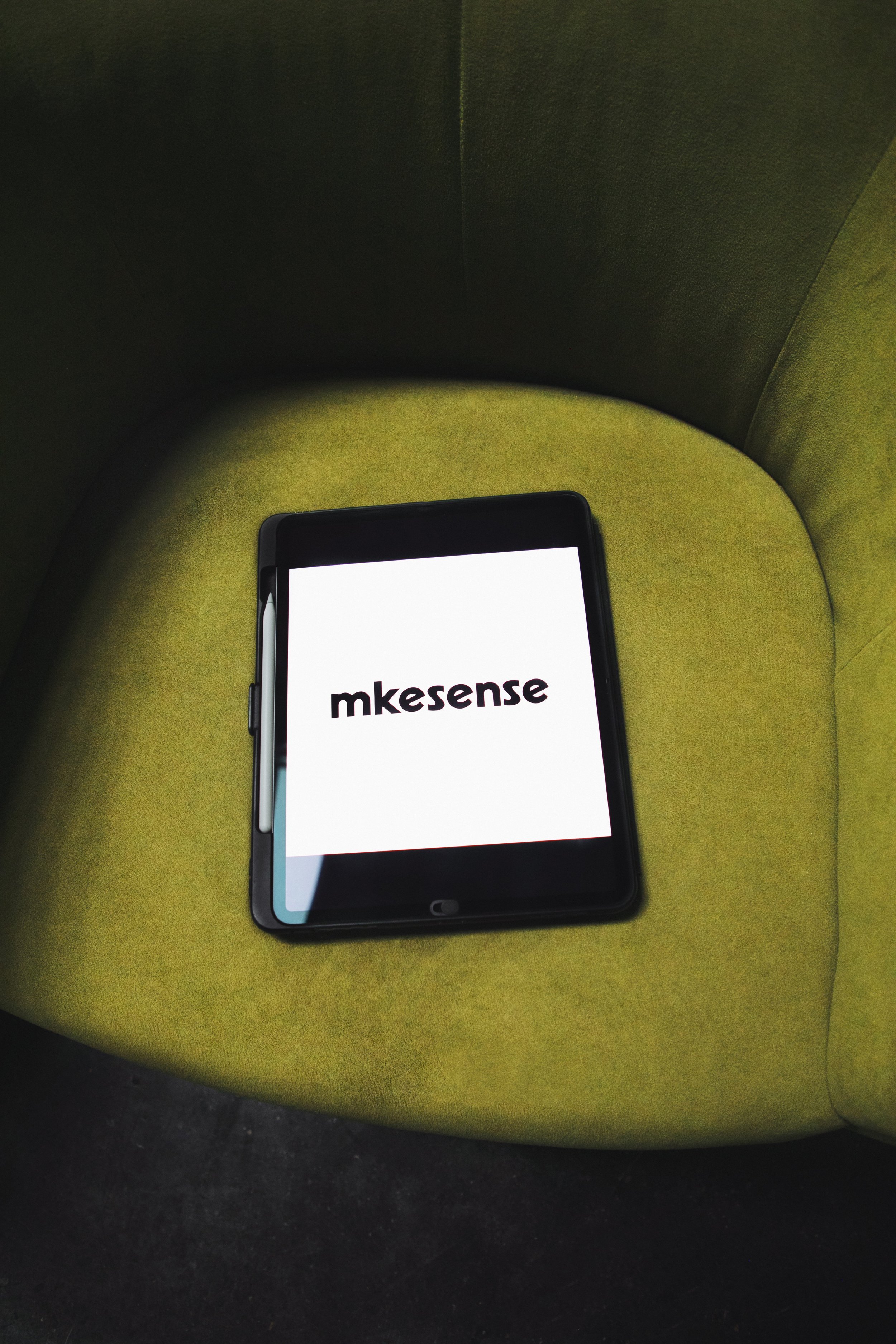
mkesense was created to unite clarity, strategy, and creativity. The name captures the idea of making sense of complex markets and brand stories, while its streamlined spelling feels professional and fresh.
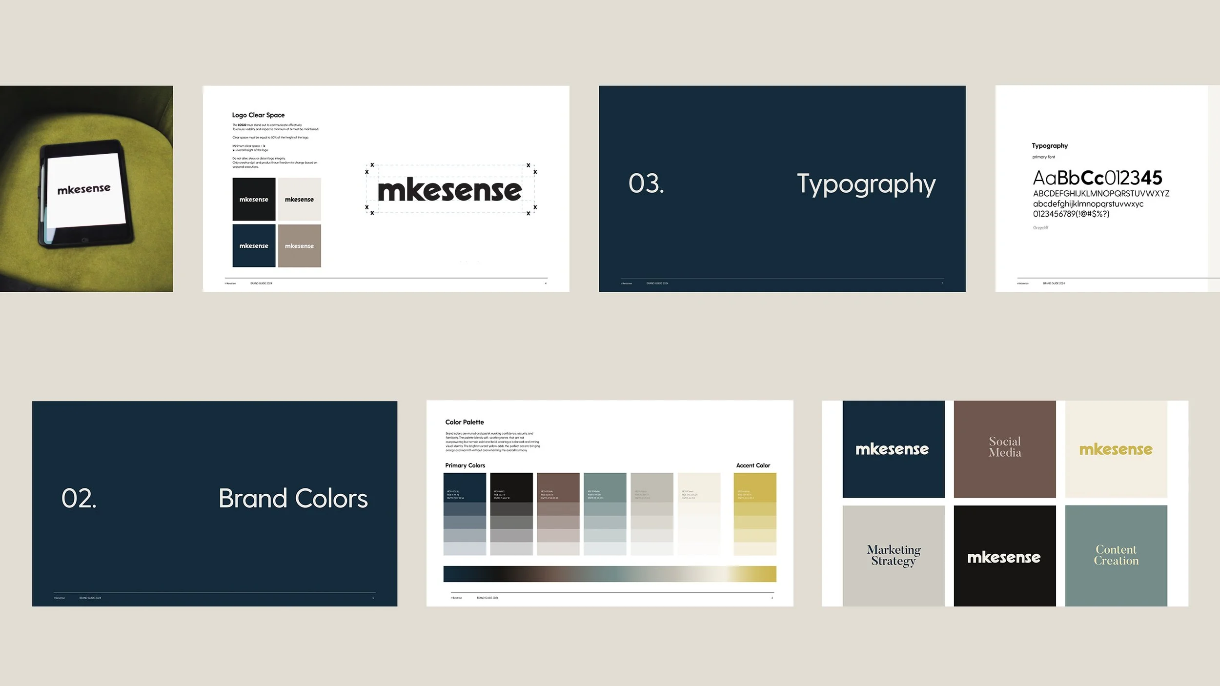
The branding balances clarity and creativity with bold, rounded typography that feels simple yet contemporary. The palette of denim blue, desaturated tones, and a yellow accent is anchored by black and off-white, conveying confidence, optimism, and timelessness.
Together, the name, design, and colors position mkesense as a modern, professional, and approachable partner that simplifies complexity and delivers results with style.
Project Scope:
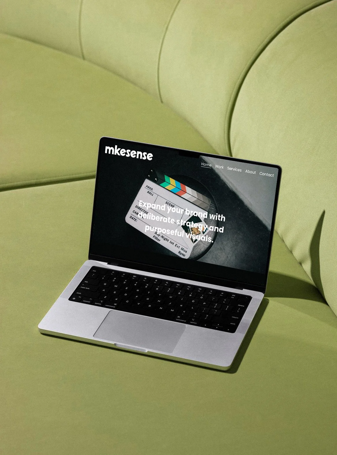
Brand name creation, logo design and full branding system, website design and development, brand guidelines, photography.

Photography
Photography